PARTNER VISUAL IDENTITY GUIDELINES
JUST EAT
Visual identity
Graphic design
Art direction
2024
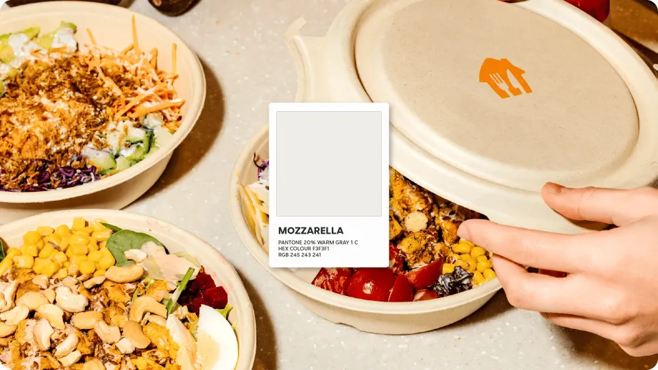
A multi-market rebrand spanning 16 regions and seven sub-brands, where we reimagined our restaurant and grocer partner identity to move at operational speed with clarity and cohesion. By elevating warm white, named Mozzarella as in Just Eat Takeaway.com colour brand palette, as a defining tone and refining our visual language, we built a scalable system that both balancing professionalism with human warmth and empowering stronger partner engagement, sharper differentiation, and seamless execution across markets.

THE PROBLEM
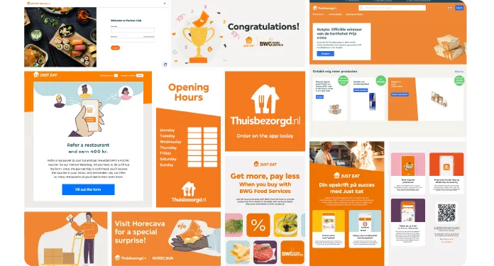
A fragmented visual identity
PROCESS & DECISIONS
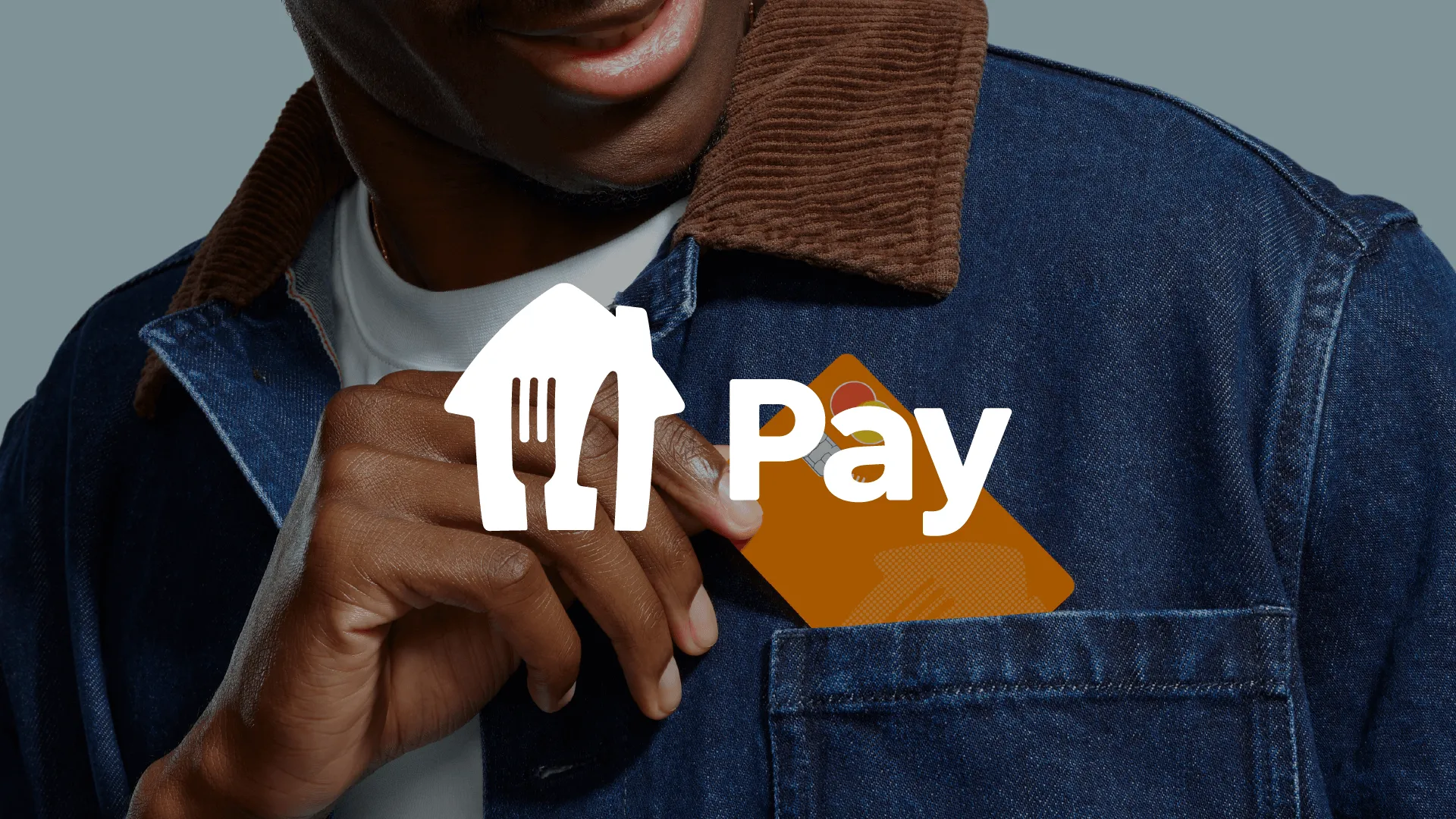
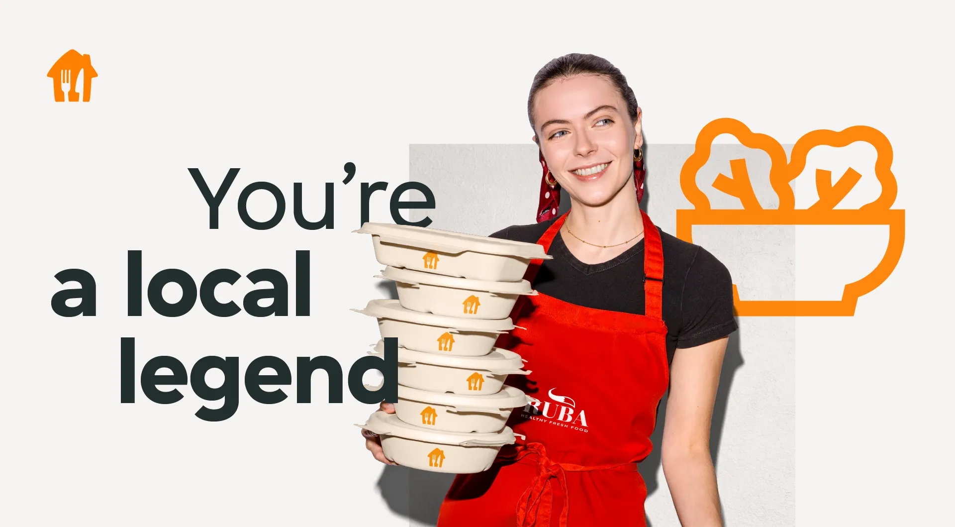
The refreshed identity needs to strike a balance between professionalism and a human touch while staying true to our consumer visual guidelines. The colour palette centres on Orange, Charcoal, and Mozzarella to signal a more focused, business-oriented approach. Charcoal is used for headlines and body copy to support clarity and accessibility across all mediums.
IMPACT
The rebrand brought clarity and professionalism to our partner marketing while keeping the tone approachable and relatable. It also enabled us to deliver cohesive messaging across markets and channels, and strengthened our differentiation from competitors. Streamlined guidelines simplified workflows and localization, enabling impromptu campaigns and faster execution for our in-house team & agency.


YEAR 2024
TIMELINE 11 MONTHS
ROLE
SENIOR VISUAL DESIGNER - Creative Co-Lead
IN COLLABORATION WITH
Design Lead, Art Director, Project Manager, Copywriter Lead, Motion Designers, 3D Designers, Localisation Specialist, DTP.
Next project
JUST EAT for business