Just Eat Takeaway.com
Senior Visual Designer
2024
Just Eat Takeaway.com
Senior Visual Designer
2024
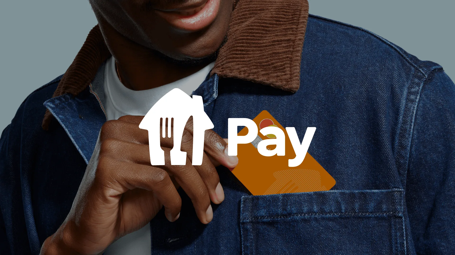
Just Eat Takeaway.com Pay is a digital meal benefit within Just Eat Takeaway.com for Business, designed to help employers offer a contemporary, flexible food experience. Built around clarity, choice, and accessibility, the product gives employees full autonomy over what, when, and where they eat, therefore supporting both remote and office work, from restaurant ordering to everyday grocery shopping. Kindly click https://www.justeatpay.co.uk/business to access the new released website based on this project.
YEAR 2024-2025
TIMELINE 6 MONTHS
IN COLLABORATION WITH
Junior Visual Designer, Product Designers, Art Director, Sr. Copywriter, Motion Designers, Localisation Specialists.
ROLE AND CONTRIBUTIONS
As Senior Visual Designer, I played a key role in:
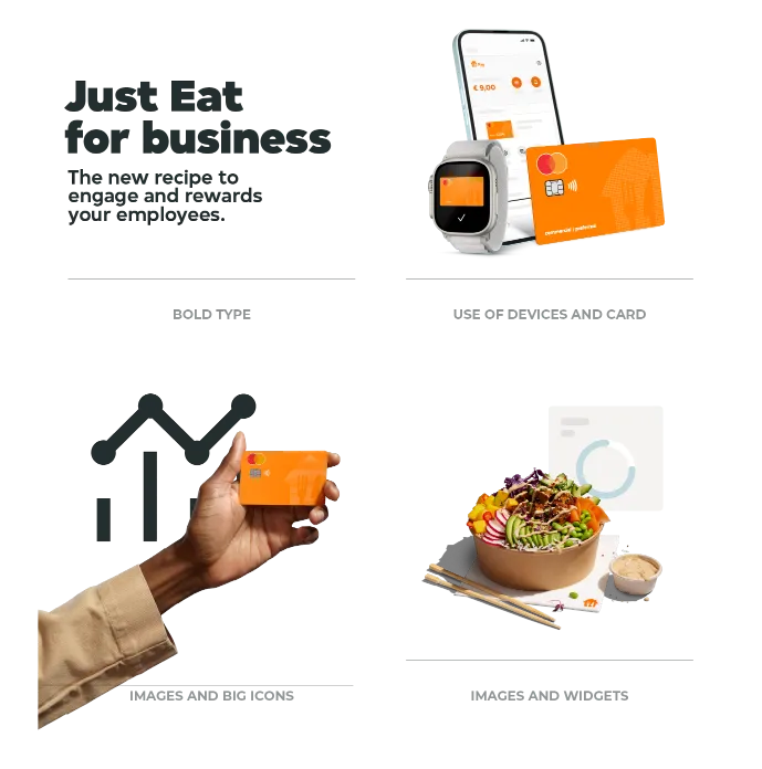
- Shaped the visual identity system, defining typography and colour principles to ensure consistency and clarity across touch points,
- Led design execution and maintained alignment across localisation with in-house teams and external agencies,
- Mentored 30+ colleagues through workshops and creative sessions,
- Established structure to ambiguous briefs by clarifying objectives with stakeholders and aligning on direction early in the process,
- Achieved design alignments by managing scope and budget expectations while establishing efficient ways of working.
THE PROBLEM
The existing visual identity was inconsistent and visually outdated, which compromised messaging clarity and limited its ability to connect with the intended target audience effectively.
PROCESS & DECISIONS
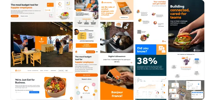
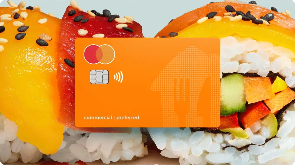
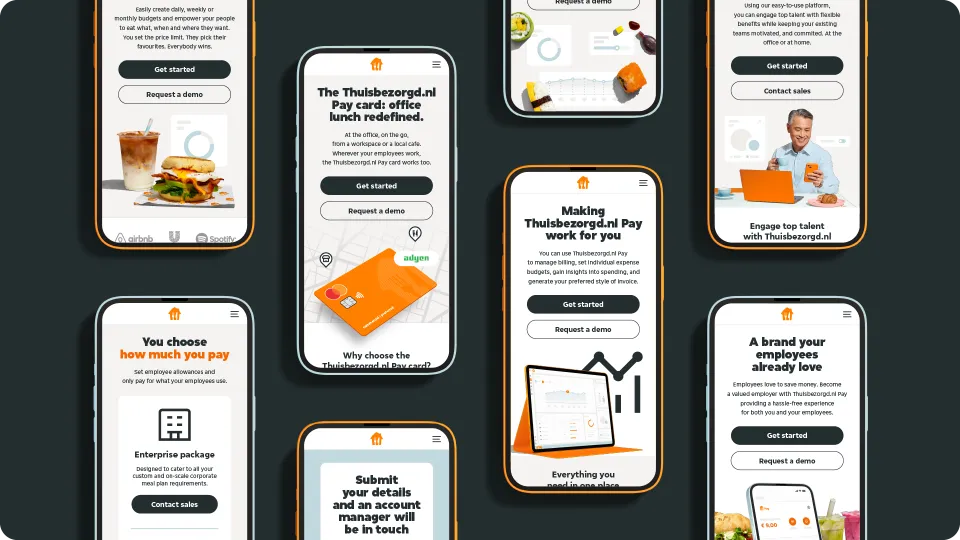
To establish a cohesive and professional B2B visual direction aligned with Restaurant and Grocer Partner Visual Identity Guidelines in the previous section, the colour palette was intentionally reduced to create focus and clarity. This approach elevated Just Eat Takeaway.com Pay Card as the key visual anchor, supported by bold, context-aware imagery used consistently across touch points. Cupcake Blue was introduced as an additional brand colour to distinguish it from restaurant and grocer partner-facing communications and to signal a tailored visual language for HR or decision-makers within companies. These decisions ensured scalability across markets while maintaining clarity and consistency.
IMPACT
The refreshed identity introduced greater structure and credibility while maintaining an accessible, human tone. It improved visual hierarchy and clarity, enabling more effective communication and alignment with contemporary design standards. The system enabled consistent messaging across regions and touch points, strengthening differentiation in a competitive landscape. Streamlined frameworks and toolkits improved collaboration and localisation by ~40%, allowing teams to execute campaigns with greater speed and efficiency.