Visual Identity System for Restaurant & Grocer Partners
JUST EAT
Just Eat Takeaway.com
Senior Visual Designer
2024
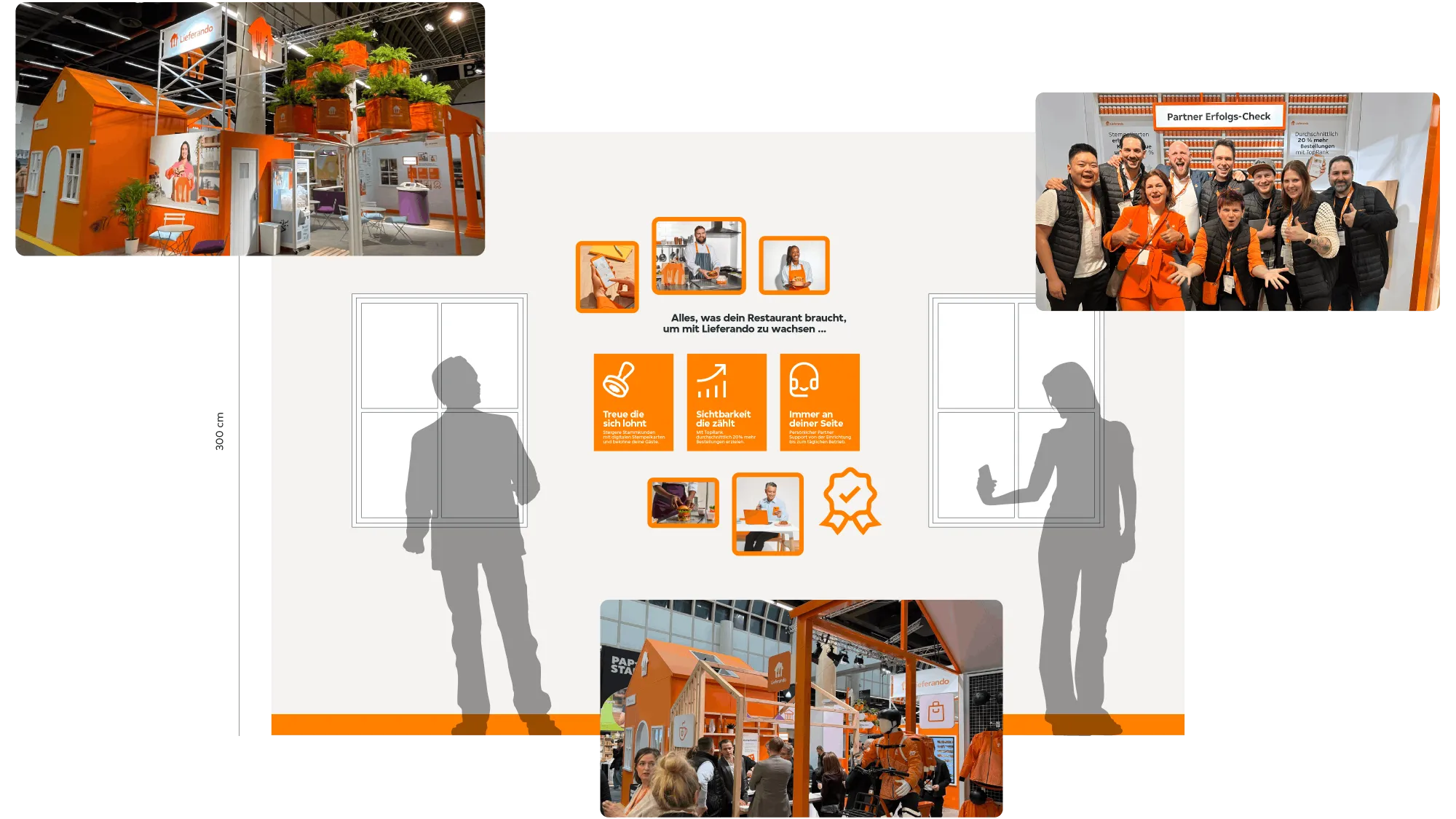
A multi-market rebrand spanning 16 regions and seven sub-brands, where we reimagined our restaurant and grocer partner identity to move at operational speed with clarity and cohesion. By elevating warm white, named Mozzarella as in Just Eat Takeaway.com colour brand palette, as a defining tone and refining our visual language, we built a scalable system that both balancing professionalism with human warmth and empowering stronger partner engagement, sharper differentiation, and seamless execution across markets.

YEAR 2024
TIMELINE 11 MONTHS
IN COLLABORATION WITH
Design Lead, Art Director, Project Manager, Copywriter Lead, Motion Designers, 3D Designers, Localisation Specialist, DTP.
ROLE AND CONTRIBUTIONS
As Senior Visual Designer, I was responsible for:
- Shaping the visual identity system, defining typography, colour, and accessible CTA principles,
- Led design execution, guided art direction and photography, and ensured consistency across localisation with in-house teams and external agencies,
- Mentored 30+ colleagues and presented work to 100+ stakeholders.
THE PROBLEM
The existing Just Eat Takeaway.com restaurant and grocer partner visual identity was fragmented and outdated, leading to inconsistent execution, reduced message clarity, and a weaker connection with their partners across markets.
PROCESS & DECISIONS
The refreshed identity balances professionalism with a human, approachable tone while remaining anchored in the core consumer brand. To clearly position the restaurant and grocer partner offering as distinct, we deliberately inverted the consumer colour hierarchy by establishing Mozzarella as the primary colour and reducing Orange to a secondary accent. This decision created visual separation from the consumer experience while retaining brand recognisability, reinforcing a more focused and business-oriented proposition. Charcoal was introduced for headlines and body copy to ensure consistent clarity, legibility, and accessibility across all touch points.
IMPACT
Brought clarity and professionalism to partner marketing while maintaining an approachable tone, fully aligned with Just Eat Takeaway.com’s consumer core visual guidelines. Enabled consistent cross-market messaging and faster campaign execution through streamlined, localisable systems. Drove ~25% increase in engagement across restaurant and grocer partner campaigns.


Next project
Rebranding Just Eat for Business